VSP.com
Used real click and heatmap data — not guesswork — to redesign the checkout flow.
VSP.com wanted a refresh, but the team was right to insist on evidence first: a redesign based on assumptions about a vision-benefits checkout flow is an easy way to break something that already works for most users.
Discover
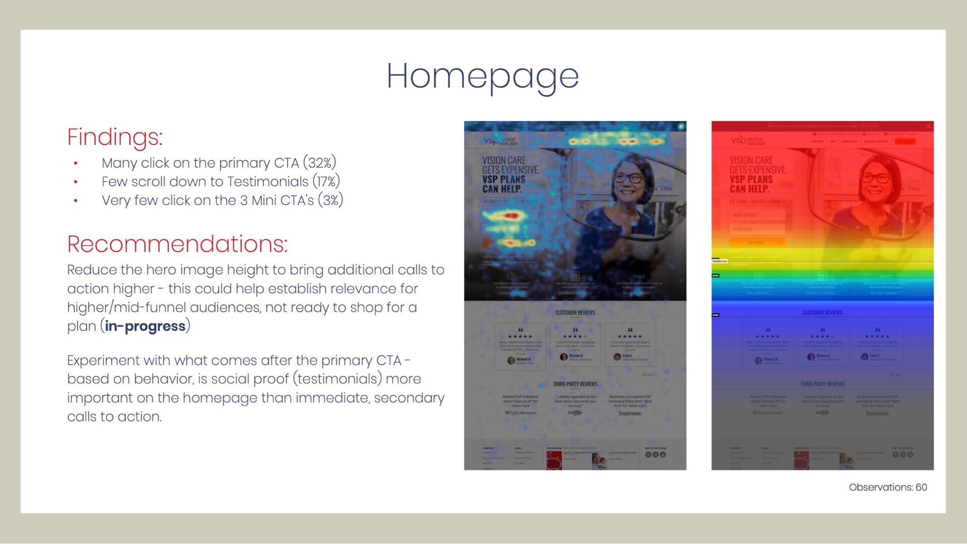
Working with the VSP team, I set up Hotjar to capture heatmaps and click maps on the live site, watching where users actually clicked, scrolled, and abandoned. Across 60 observations of the homepage, 32% of visitors clicked the primary call to action, only 17% scrolled down as far as the testimonials, and just 3% used the three secondary calls to action.
Define
Two findings set the priorities. On the homepage, most visitors never saw anything below the hero image, and the secondary calls to action weren't earning their space. In the purchase flow, the data pointed squarely at checkout: specific steps were generating disproportionate drop-off compared to the rest of the funnel.
Design
I built new wireframes for the checkout user flow in Sketch, directly informed by the click patterns rather than a generic best-practices checklist. For the homepage, I recommended reducing the hero image so the next calls to action sat higher, and testing social proof directly after the primary call to action, since the data suggested it mattered more than the secondary links.
The redesign was grounded in how users actually behaved on the existing site, not assumptions about how they should.
Open to senior product design roles
Remote (US hours), hybrid or onsite — full-time or contract. Happy to walk through the decisions behind any case study here.