Lorewheel
Party games for one shared screen. A consumer product I designed end to end, from the first sketch to a paid checkout, now live at lorewheel.com.
Group games online usually ask every guest to download an app, make an account or join from their own phone before anyone has laughed once. Lorewheel starts from the opposite brief: one screen in the room, a host who presses play, and a game running in under a minute.
Discover
I mapped the occasions people actually gather for (a party, a family dinner, a team offsite, a wedding, Halloween) and the moment each one goes flat: the first half hour when people arrive in ones and twos and nobody knows what happens next. That moment, not the game itself, became the problem to design for.
Define
Four rules came out of it and every screen answers to them. The room is the user, so one screen is enough and phones are optional. No sign-up stands between a host and the first game. Names typed during a game stay on the page. And an event is paid for once, not by subscription.
Design
I designed the system first (navigation, the game card, the pack page, the checkout) and then gave each game its own look, type and illustration so a catalogue of 200 never reads as a template repeated. Design and front end moved together, so every decision was tried on a real screen the same day it was made.
Live at lorewheel.com: more than 200 games, 56 of them free, eleven event packs sold once each, and a Pro plan for groups, with checkout through Stripe.
From the first question to a paid pack
Six screens from the live product, captured from lorewheel.com: how a host finds a game, how two people play on one phone, how an event is sold, and what brings someone back between parties.
One question before a list of 200 games
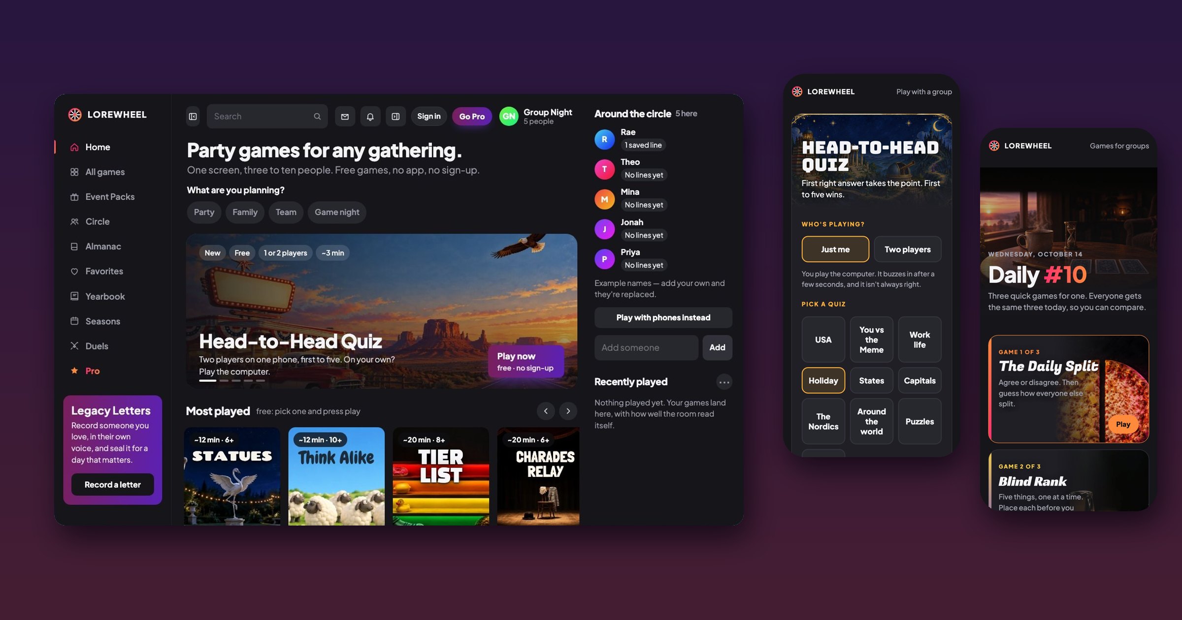
A catalogue this size is a wall unless the first screen narrows it. The home page asks one thing, what are you planning?, and the four answers (party, family, team, game night) reorder everything below. The group sits in a panel on the right with example names that disappear the moment you add your own, so the page shows how the room will look before anyone types.
Sold for the night it's for, paid once
Packs are ten games for one kind of event: a wedding, a team offsite, Halloween. They are bought once and kept by the group, because nobody wants a subscription for a party they throw once a year. The page sells the evening rather than the list: what to play as people arrive, in the middle and to finish. The game and quiz pages offer whichever holiday is next on the calendar first.
A page for the person who books the offsite
The team pack has a different buyer: the person handed “can you sort out the offsite?” This page speaks to them, with an agenda, a facilitator's run-sheet and the end of the day (anonymous thanks, awards, a sealed note that opens at the next offsite). A free game sits beside the buy button so they can try it on their own before putting it in front of a team.
One phone, two players, facing each other
The quiz is played with a phone flat on the table between two people. This is the near player's half of the screen; the other half shows the same question turned around to face the player across the table, so each reads their own copy and has their own three buttons. The first right answer takes the point; a wrong answer locks that player out of the question. There is nothing to install and nothing to join: the device in the room is the whole product.
Two decisions, then play
Setup is two choices on one screen: who's playing (just me, against a computer that buzzes in after a few seconds and is sometimes wrong, or two players) and which quiz. Names typed here stay on the page. The page counts that a game started and finished, and nothing about who played.
A reason to come back between parties
A party product is used a few times a year. Daily gives one person three quick games each day, the same three for everyone, so you can compare with friends. It is the habit loop for the weeks with no party in them, and it leads back to the group games.
The way back from checkout
Browsers keep the page you just left in memory and hand it back exactly as it was, so a buyer who reached the payment page and pressed Back found the buy button frozen on “Opening checkout…”. Every page that opens checkout now resets its button when it is shown again. The person who comes back to think it over hasn't said no, and the screen shouldn't answer for them.
Open to senior product design roles
Remote, US hours — full-time or contract. Happy to walk through the decisions behind any case study here.