FastDAR
Fast, low-cost text checks for apps and AI agents. Product design for an API product now live at fastdar.com, from the landing page and its live demos to account and billing.
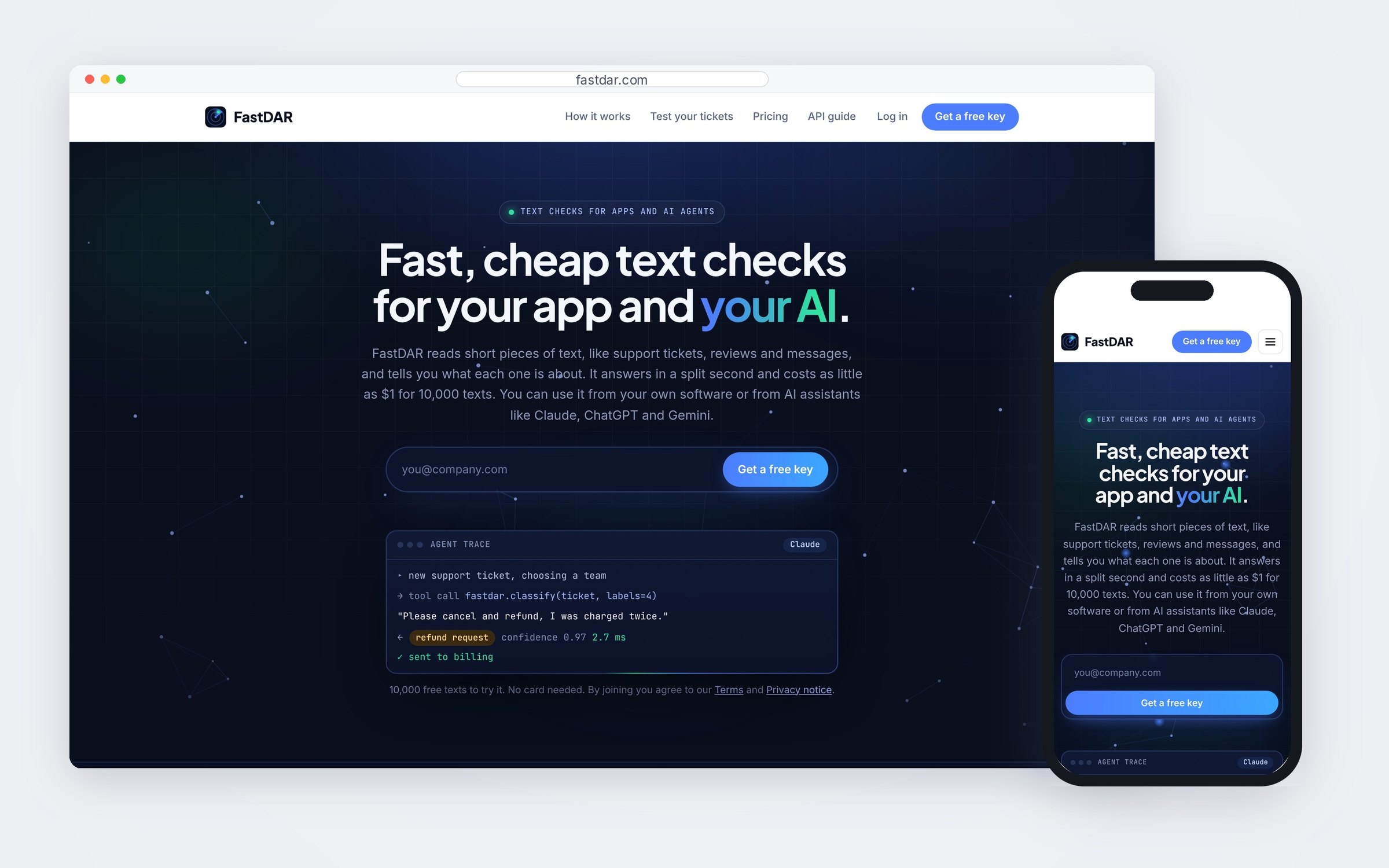
FastDAR answers simple questions about short pieces of text (which team a support ticket belongs to, which label fits a review) in about 3 ms, for as little as $1 per 10,000 texts. The design problem was that both numbers sound abstract, and the people deciding whether to use it are often not machine-learning specialists. Its speed, its price and its honesty about uncertain answers all had to be shown, not claimed.
Discover
The two questions a buyer brings are “will it be right on my texts?” and “could this run up a bill?”. A spec sheet answers neither. Accuracy only becomes believable on your own data, and cost only becomes safe when there's a hard stop.
Define
So the site leads with things a visitor can run instead of things they have to trust: a live sort at measured speed and price, a box to try their own text without an account, a race against a general model with its estimate labelled as one, and a free test on their own past tickets. Every figure either comes from a public test anyone can rerun or says it's an illustration.
Design
The account carries the same rule into billing. Prepaid credits stop at $0, and monthly billing always has a spending cap the customer sets. The side panel repeats the balance or the cap on every screen. Uncertain answers are shown with their scores and routed to a person, rather than hidden behind a confident label.
Live at fastdar.com, with 10,000 free texts to try it, pay-as-you-go pricing from $1 per 10,000 texts, and access from customers' own software or AI assistants like Claude, ChatGPT and Gemini.
From the first demo to a capped bill
Ten frames: the live site's interactive sections, then the account and billing screens. Account screens are shown with example accounts and demo figures, not real customer usage.
Speed and price you can watch
“About 3 ms and $1 per 10,000 texts” means little to someone who doesn't work in machine learning. So the page shows it: messages pour in and land in labelled lanes at the measured speed and price, under live counters for time, cost and the share handed to a person. The fifth lane matters most: anything FastDAR isn't sure about goes to a person rather than a guess, and the page counts those openly.
The real answer before any sign-up
Visitors type their own message and their own labels and get FastDAR's actual answer, with how sure it is, how long it took and what it would have cost, without an account. Presets for a support ticket, a product review, a sales email and a job applicant give people a starting point so the box is never blank.
A comparison that labels its own estimate
The race runs at real speed: a large general model answering one review at a time against FastDAR. FastDAR's speed and price are measured; the big model's are an estimate, and the page says so in the caption under the race rather than presenting a guess as a benchmark.
Showing the uncertain answers too
The after panel is real output from four label names and no examples, and it includes the weak result: a flickering-screen review classed as a defective product at 0.56 confidence. Keeping a low-confidence answer on the page, with a line explaining that FastDAR says when it isn't sure, does more for trust than five perfect scores.
Four prices, no plans to compare
Pricing is a short list of what each job costs, with the free allowance first: every new email address gets 10,000 texts with no card. There's no monthly fee and no tier grid, because the customer's real question is what a batch of texts will cost, not which plan they fit into.
A bill can't surprise you
Prepaid credits are the default: each call takes its price off the balance, and calls stop at $0, which the side panel repeats on every screen. Monthly billing is offered as an alternative, but only with a spending cap the customer sets and an explicit agreement checkbox. Shown with an example account, not real usage.
The cap is the first thing you can change
On the monthly plan the screen leads with the month's bill against its cap, then the cap itself, explained in one sentence: when it's reached, calls pause until the 1st and the customer gets an email, so a runaway script can't run up their card. Receipts and card details stay on Stripe's own page.
Three numbers and a chart
The overview answers what an API customer checks first: what this month will cost, how much they've sent, and whether usage is steady or spiking. The guide and the ticket test sit one click away, because the next action for most accounts is connecting something or checking accuracy. Figures are from an example account.
The demos work on a phone
Each interactive section was designed for a phone as well as a desktop, so someone who opens a shared link on their phone can still watch the sort run and try their own message, not just read about it.
Billing controls in one column
On a phone the account collapses to one column with the balance or bill always at the top, so checking spend or raising a cap is a single scroll rather than a hunt through settings. Shown with example accounts.
Open to senior product design roles
Remote (US hours), hybrid or onsite — full-time or contract. Happy to walk through the decisions behind any case study here.