Taveli
Dating with direction. An iOS and Android app I designed end to end: it explains why two people might click, keeps sensitive preferences private, and gives people a real reason to meet.
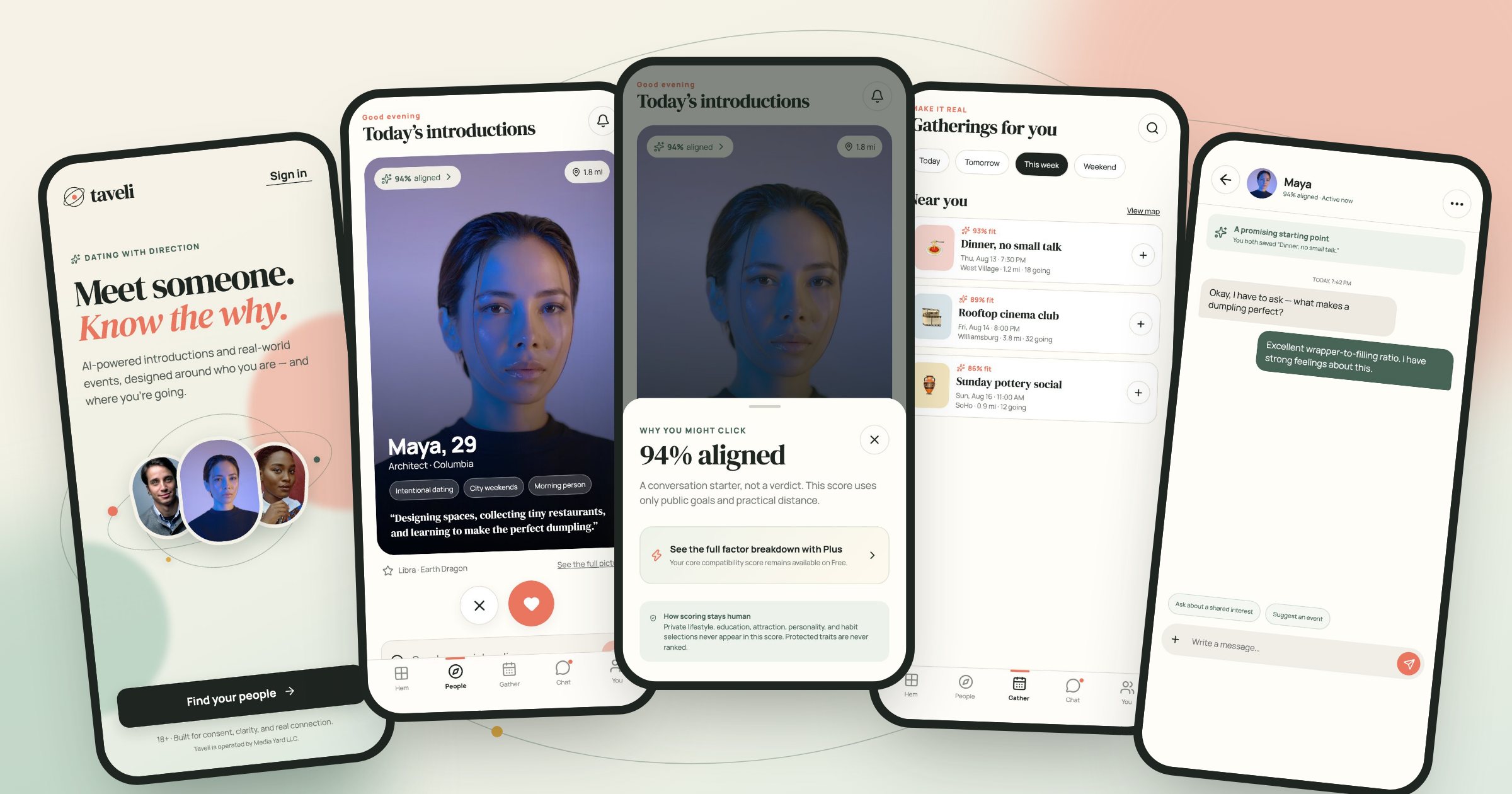
Most dating apps are built to hold attention: a stack of faces, a swipe, and a score you never see. People are left guessing why someone was shown to them, and the things that matter most (what they want, how they live, what they would rather keep private) are either ignored or put on display. Taveli starts from a different brief: show people why a match might work, protect what they tell the app, and move the conversation off the screen.
Discover
I looked at where dating apps lose trust. People can't tell why a profile was chosen for them. The preferences that matter most are either missing or shown on a public profile. And a match too often ends in a chat that goes nowhere. Those three became the problems to design for.
Define
Four rules came out of it and every screen answers to them. Explain, don't rank: a match shows its reasons, never a score of the person. What you tell the app about attraction, money and lifestyle stays private and never appears on a profile. Protected traits are never ranked. And the app should end in a plan to meet, not a longer chat.
Design
I designed the system first (the match card, the explanation sheet, the note that carries every privacy promise, the gathering card) and then the five tabs around it. One codebase runs on both phones, so I designed and built together and checked every screen at iPhone and Pixel sizes the day it changed.
Built for iOS and Android from one codebase, with sign-up, matching, explanations, gatherings with RSVPs, messaging, privacy controls, reporting and a Plus membership through Apple and Google billing. The site is live at taveli.app; the apps are preparing for the App Store and Google Play.
From the first screen to a plan to meet
Six screens from the app itself, captured at iPhone 16 Pro and Pixel 7 sizes using the app's preview mode, which fills it with sample members. Taveli is a native app on both platforms, built once and fitted to each phone's safe areas, tab bar and back gesture.
iOS
iPhone 16 Pro · 402 × 874 ptSay what's different before asking for anything
The first screen makes one promise, know the why, and shows it: three people on an orbit, not a stack to swipe. One ink button starts sign-up. The line under it says who the app is for (18 and over) and who runs it, because trust starts before the account does.
One person at a time, with a reason attached
Each introduction is a single card: the photo, a few words about the person in their own voice, and a 94% aligned badge on the photo. Pass and like are large round targets under the card, with like in coral. The name is set in the app's sans, so it reads as a person rather than a headline.
The number opens into its reasons
Tapping the badge opens a sheet that says what the number is: a conversation starter, not a verdict, built from public goals and practical distance. It ends with a green note that private lifestyle, attraction and habit choices never feed the score, and that protected traits are never ranked.
Android
Pixel 7 · 412 × 915 dpA short list, not an endless one
Today shows a handful of introductions as a grid, with their neighbourhood and distance. Above them, a warm banner says how many people have already chosen you. A small daily number is the point: it asks people to look properly rather than keep scrolling.
Somewhere to meet that isn't a first date
Gatherings are small local events (a dinner, a rooftop film, a pottery morning) each with how well it fits you, when, where and how many are going. A round button joins. Meeting in a group takes the pressure off a first meeting and gives two people something to talk about.
A chat that points at a plan
The thread opens with what two people share: here, that both saved the same dinner. Prompts above the keyboard suggest asking about a shared interest or suggesting an event, so the obvious next step is meeting rather than another week of messages.
Native on both
One codebase builds the iOS and Android apps. Each respects its platform: safe areas around the Dynamic Island and punch-hole camera, the Android back gesture, and each store's own billing.
Private by structure
Attraction, money and lifestyle preferences are kept in a separate private table that other members can't read, so the promise on screen is enforced by the database, not by a setting.
Leaving is built in
An account can be deleted from the app’s own settings or from a page on taveli.app, as both stores require, and members can report or block anyone from a profile or a chat.
Privacy and pricing said out loud
Three more screens where trust is won or lost: signing up, controlling what others can see, and paying.
Three fields and a plain promise
Sign-up asks for a first name, an email and a password, nothing more. The line under the headline sets the terms before the form does: private by default, your sensitive matching preferences stay under your control. The age and terms checkbox is required and links to both documents.
The controls live on the profile
Your own profile is also where you decide how matching works: preferences, how much each factor weighs, whether astrology counts at all. Safety and privacy sit on the same screen, with incognito mode (only people you like can see you) a single switch away.
Pay for tools, never for rank
The membership page says what money can't buy before it says what it can: upgrade your controls, not your rank. Membership never changes who sees you first. Free keeps the core score and its explanation; Plus adds invitations, more introductions and the full breakdown.
How I built Taveli from its design system
Taveli's look is warm and editorial: a cream ground, an ink button, green for what is calm and private, coral for warmth and intent, a display serif for places and moments, and Manrope for people and controls. I wrote the system down from the app's own stylesheets, with a script reading every colour, size and radius out of the CSS, and it stops if a value it names ever leaves the code.
Explain, don't rank
The one number in the app is a compatibility percentage, and it always opens into its reasons. It is styled as a calm green chip on the photo, never as a badge of worth.
Give colour a job
Green marks privacy promises and chosen things; coral marks liking, sending and progress; red is kept for errors. One ink button per screen carries the main action.
One note, four tones
The same rounded note carries privacy promises, plain facts, invitations and warnings. In Figma each tone is a mode, so a note changes mood without being redrawn.
Hand it over
The tokens became Figma variables and styles, the screens became editable layers, and the same system went into Claude Design, so the next designer starts from what ships.
The badge that opens into reasons
The compatibility badge is the product's argument in one component: the green that means calm and chosen, a pill shape, a sparkle and a percentage. Tapping it opens the sheet that explains it. Tracing it back also showed that its cream fill is typed by hand in the CSS rather than drawn from a token, so it went on the list.
Named for the job they do
Role colours point to primitives named by hue. A designer picks action-selected, not a green, and a change to the green reaches every chosen chip, joined event and sent message.
One note in four moods
Calm carries privacy promises, neutral carries plain facts, warm carries an invitation and alert carries an error. Every tone's text passes 4.5:1 on its own fill.
Serif for places, sans for people
DM Serif Display sets page titles, gathering names and quotes; Manrope sets names of people and every control. The 9px caption is in the file because the app uses it, and marked to retire.
Round, soft and warm
Eight named radii, from the meter bar to the fully round chip, soft warm shadows under the ink button and round actions, and the components the tokens draw.
The heading font never loads
Every heading asks for DM Serif Display, but the app doesn't ship it, so iPhone draws headings in Times and Android in its default sans. The two platforms looked different by accident. The fix is one import, and it is first on the list. The audit also found coral text at 2.83:1 and grey captions at 4.24:1, under the 4.5:1 small text needs, and text down to 9px.
In Figma and in Claude Design
Two Figma plugins: one creates the variables, tones as modes, text styles and effects; the other rebuilds ten screens at iPhone and Pixel sizes as editable layers. A drag-in SVG kit for files without plugins, and the same system set up in Claude Design, so an agent building for Taveli starts from the real rules.
Open to senior product design roles
Remote (US hours), hybrid or onsite — full-time or contract. Happy to walk through the decisions behind any case study here.