Nester.app
Took a real estate management SaaS from unfinished build to launch-ready, end to end.
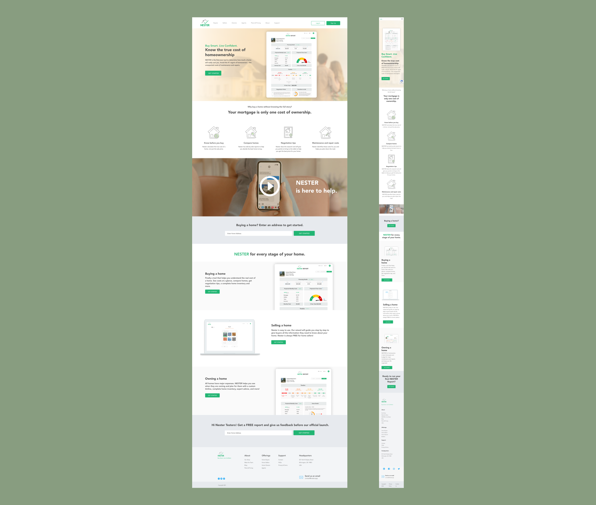
Nester needed two things finished at once before launch: a public marketing site and the property-management SaaS product sitting behind it — built by different people, on different timelines, with no shared system tying them together.
Discover
I audited what already existed — a partially built marketing site and an early dashboard prototype — to see what could be salvaged versus rebuilt, and talked to the team about how property managers actually used the early product day to day.
Define
Rather than treating the marketing site and the dashboard as two separate hand-offs, I defined them as one connected system: same visual language, same voice, with the marketing site setting up promises the product then had to keep.
Design
I designed the responsive marketing site and the core SaaS dashboard in Figma, then extended the same system into the recurring Nester reports and email campaigns that kept property managers informed between logins. The four core product surfaces are below.
Nester launched with a consistent experience from the homepage to the dashboard to the inbox, instead of three disconnected pieces.
Two sides of a sale, one data loop
Nester's core mechanic is that buyers and sellers feed the same engine: a buyer requests a report on a home, the seller (or their agent) completes a wizard describing the home's systems, and both sides get the payoff — a report that turns the house into a 15-year expense timeline. These four screens walk that loop in order.
Shopping with a budget of reports
Buyers add homes by address and spend report credits on the ones they're serious about — "7 reports left" sits right in the section header, making the free tier legible without a paywall in the flow. The empty slots aren't placeholders, they're invitations: eight certificate-icon cards that say the dashboard's job is comparison. And the corner card — "I'm also selling a home" — quietly handles the truth of the market: most buyers are both roles at once.
A physical for the house
The wizard is where the data comes from, so it's built to fight abandonment: every system gets its own progress bar and a plain-language grade — Roof 93% Strong, HVAC 18% Weak — while the donut rolls it all up to one number. Required and optional are honestly separated, so sellers know exactly what stands between them and submitting, and the grades show precisely where their report will be thin if they stop early.
Views are the reason to come back
The seller's home base mirrors the buyer's — same layout grammar, different verbs. Each listing card leads with attention ("16 new views · 38 total") because that's what sellers actually check for, and wears its completion meter directly on the photo: an 89% Strong listing is a listing buyers can trust. The one unfinished step stays pinned as the card's single call to action.
The thesis, as a timeline
This is the screen the whole product exists to produce, and it's the brand's tagline made visual: most unexpected home expenses aren't unexpected. Every major system is placed on a 15-year timeline — overdue, due soon, medium, long-term — with a $68,000 total, and then translated into the number people can act on: a monthly Nester Fund set-aside alongside the mortgage and utilities. A house becomes a cash-flow plan you can print, download, or share.
Open to senior product design roles
Remote (US hours), hybrid or onsite — full-time or contract. Happy to walk through the decisions behind any case study here.